Ti-Tree Family Doctors Website Design
About Ti-Tree Family Doctors
The general design concept should be like a ‘mobile first’ design and engage the visiting patients looking for Ti-Tree’s website or the services.
This is not necessarily competitive but the need to rank for the key services in their geographic region for local search will be a key feature of the SEO efforts.
Website Focus
The new website to be more patient focused and answer the following questions:
- How Can We Help
- What We Offer and What’s In It For Me
- Where Are We
- When etc
The website also needs to support the patients’ sense that Ti-Tree Family Doctors is the right choice both professionally as well as showing a caring local and full service solution.
Do You Care About Me?
This can come from the open layout and half tone colours and the key messages and zones on the home page.
Purpose
The website's purpose is to position the practice, but not be seen as a sales focused website. Rather Dr Kosenko wants to be seen as the right choice and the SAFE choice.
He wants to not only differentiate the services by location but also by the feature of range of core and special services using a simple, professional, engaging and contemporary design.
Fonts, Colours & Logo
- Font - san serif consistent throughout the website
- Logo - the existing Ti-Tree Family Doctors
- Menu Tabs - suitable colouring
Re The logo - the original hi res logo is in the PMS - It is unlikely that the client can acquire a layered version - is it possible to separate the text and rectangle and have only the oval sea shells as the logo with the text - Ti-Tree Family Doctors.
Design Framework
Dr Kosenko likes highly visual content.
The resultant design needs to be less cluttered, clear and focused on their core areas of service. Too many colours or tonal variations will not work.
Above the Fold
Top Zonal Design Elements
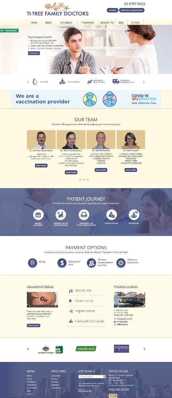
Header: (top LHS)
- Logo (as above)
- Ti-Tree Family Doctors
Header: (top RHS)
- Telephone
- Add Locations Button
- Add Request an Appointment Button
Menu: Home | About | Conditions | Treatments | First Visit | Blog | Contact
What We Treat?
Like the services Icons should be less formatted no circles or squares
Our Team
- Showcase Our Team offering personal attention throughout your treatment journey the team
- Team of experienced professionals
Payment Options - like Oclinic
- Private, Public, Schemes
Other Elements Band
- First Visit & Patient Forms
- Locations Map with location - http://www.sydneyorthoptic.com.au/contact/
Footer Zone
- Credibility Bar
- Footer Zone
- Menu summary,
- Website search
- Social icons and Doctoralia link similar to Dr Waller’s home page
Link to Website: https://www.ti-treedoctors.com.au/
Also refer to our other websites:
Dr Roger Brighton,
Apex Cardiology